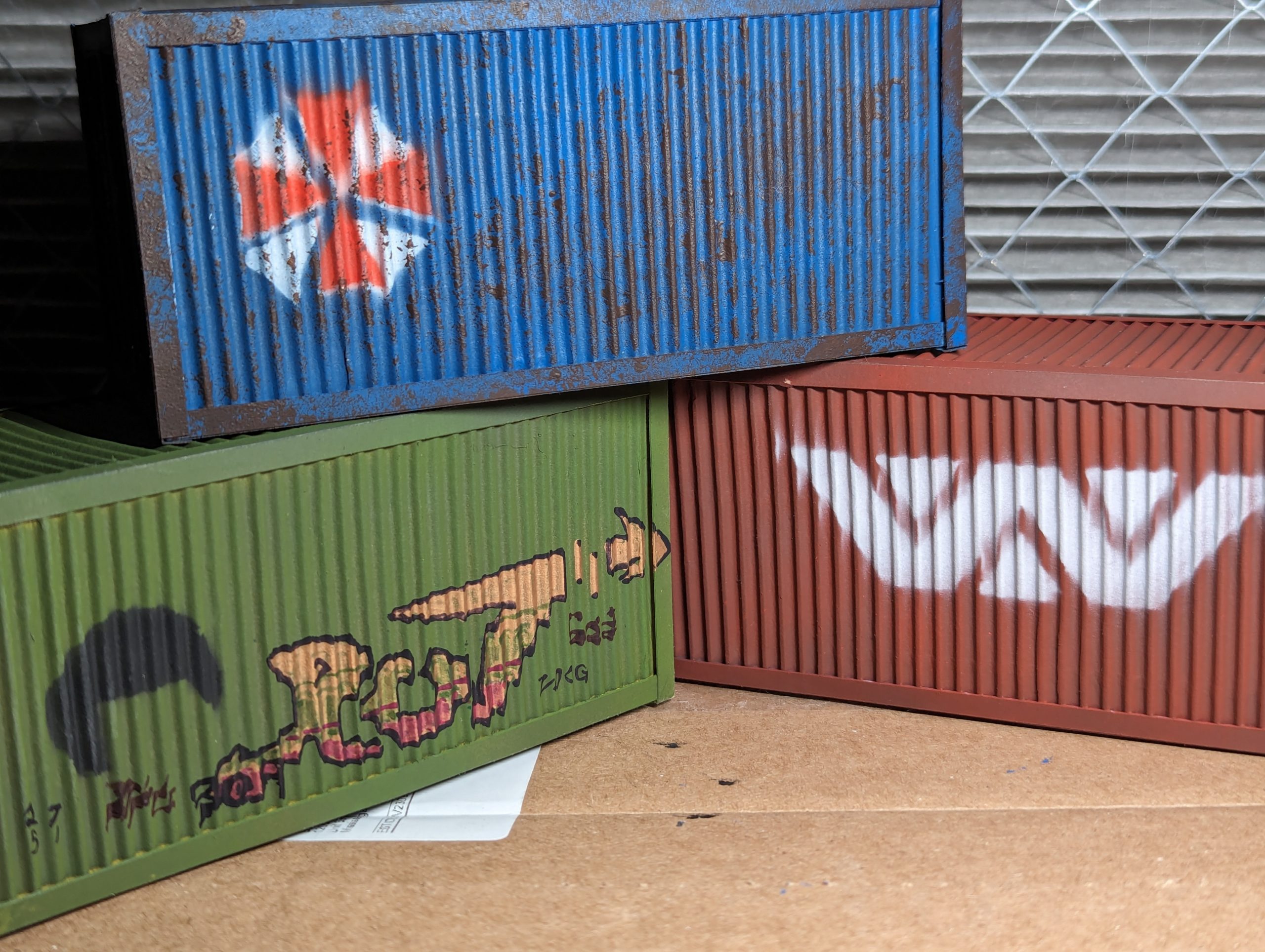
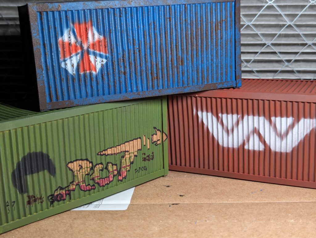
Continuing from the last post about this, I spent the last few days doing a lot of airbrushing. First, I hit my fully built containers with a primer coat of grey because the Vallejo black I’ve got has fantastic coverage but (like all black undercoats) mutes colours something fierce, but my Vallejo white (like all white undercoats) struggles to get full coverage. The grey still muted my red, and turned my yellow green, but I got some decent “industrial shipping” colours out of it. The yellow turning green is a pretty good indicator the Vallejo black is actually a dark blue, because yellow is transparent as hell and will turn green over a blue undercoat. But I’m not totally sure and I actually liked the end colour so I’m not complaining. Bob Ross happy little accident.
Anyway, once I had them primed I grabbed some scrap pieces of the corrugated cardboard I used to make them and cut out some stencils. Mating the curves of the stencil to the surface I was painting helped prevent a lot of overspray. I applied three pretty classic dystopian SF icons to the crates with… shall we say technique that was more educational than polished. Specifically, while red-over-white really helped with the colour of the Umbrella logo, but getting the second stencil lined up by hand wasn’t super easy. I’ll have to look up graffiti techniques to see how they do it.
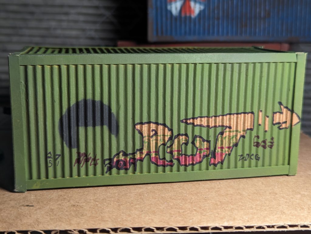
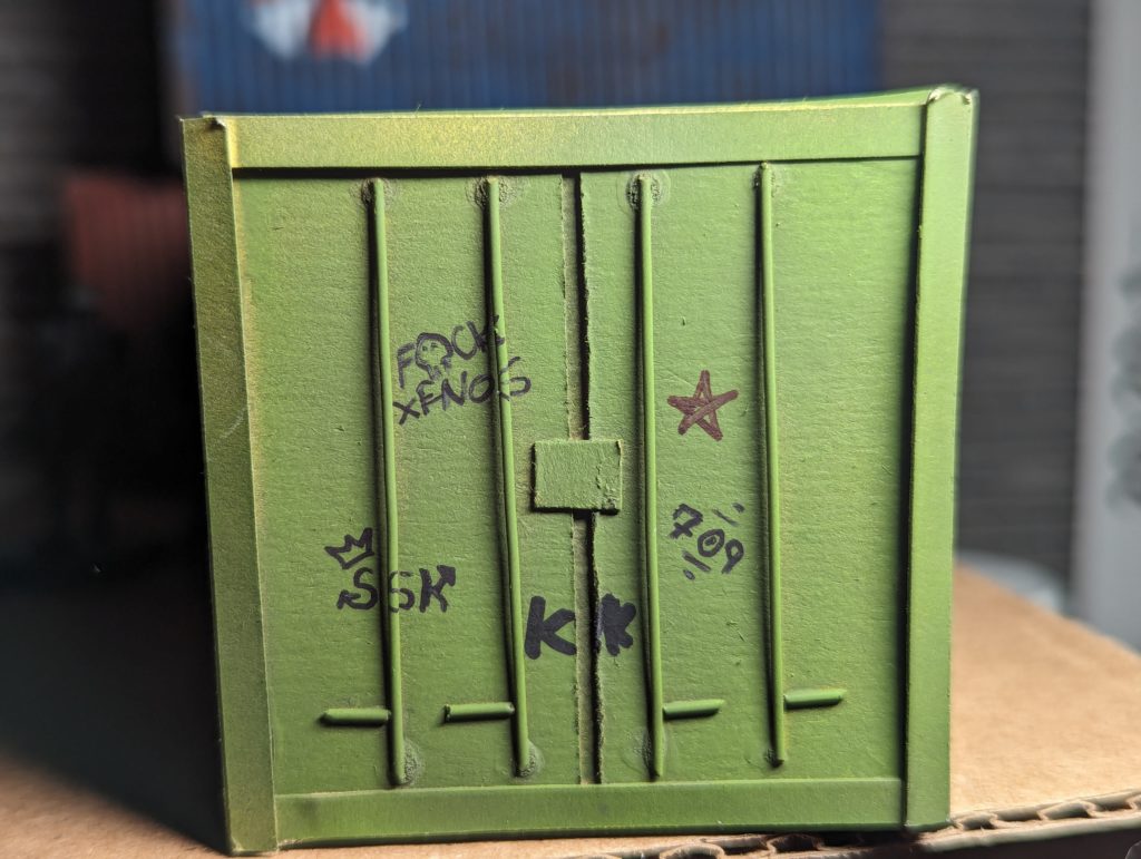
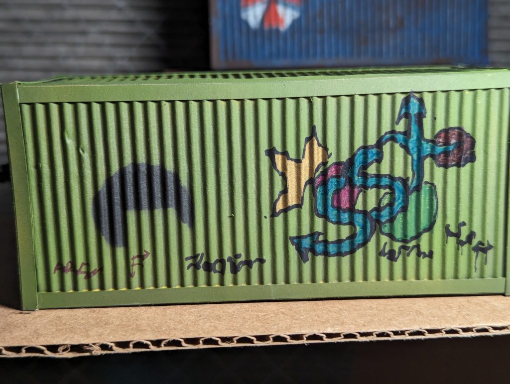
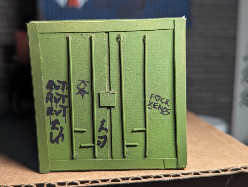
Speaking of graffiti, I wanted one container to be pretty normal looking, one to be rusted to hell, and one to be covered in graffiti. Since blue contrasts best with brown and orange, Umbrella got a very thorough sponging of a dark brown. I’ve done fantasy figure rust with reds and bright oranges and my instinct was to go that way, but all the reference images I could find had the same dark brown rust with orange streaks. I could have streaked the brown, but I’m trying to keep myself to a sort of 80% effort, experiment-once approach to my painting these days. Plus, it did match some of my reference images so I didn’t think it looked too bad. Black Mesa got the graffiti treatment. I was thinking I might try airbrushing it for a spray paint effect but I found that a dozen coloured and metallic sharpies really got me more of what I was looking for. Weyland-Yutani got to stay clean by default.
I kind of wanted to try some Tyrell or Cyberdyne logos, but all of them have much more detailed designs. I might get some transfers printed up and use them on future terrain, though. It’s kind of nice to be doing stuff totally unprofessionally so I can slap non-canon and incongruous but fandom-happy details everywhere. “Okay folks, in this campaign ENCOM and X-COM are fighting a corporate war…”