I did a shitload of airbrushing yesterday. People are complimenting the sudden increase in my skills, which I’m going to take as a compliment because I’m a technophile and using tools to replace my personal lack of skill counts as a good thing I do and the outcome is good (not AI though, get rekt scrubs). So, as planned, I’m going hard on a synthwave look for my gay commie robots.
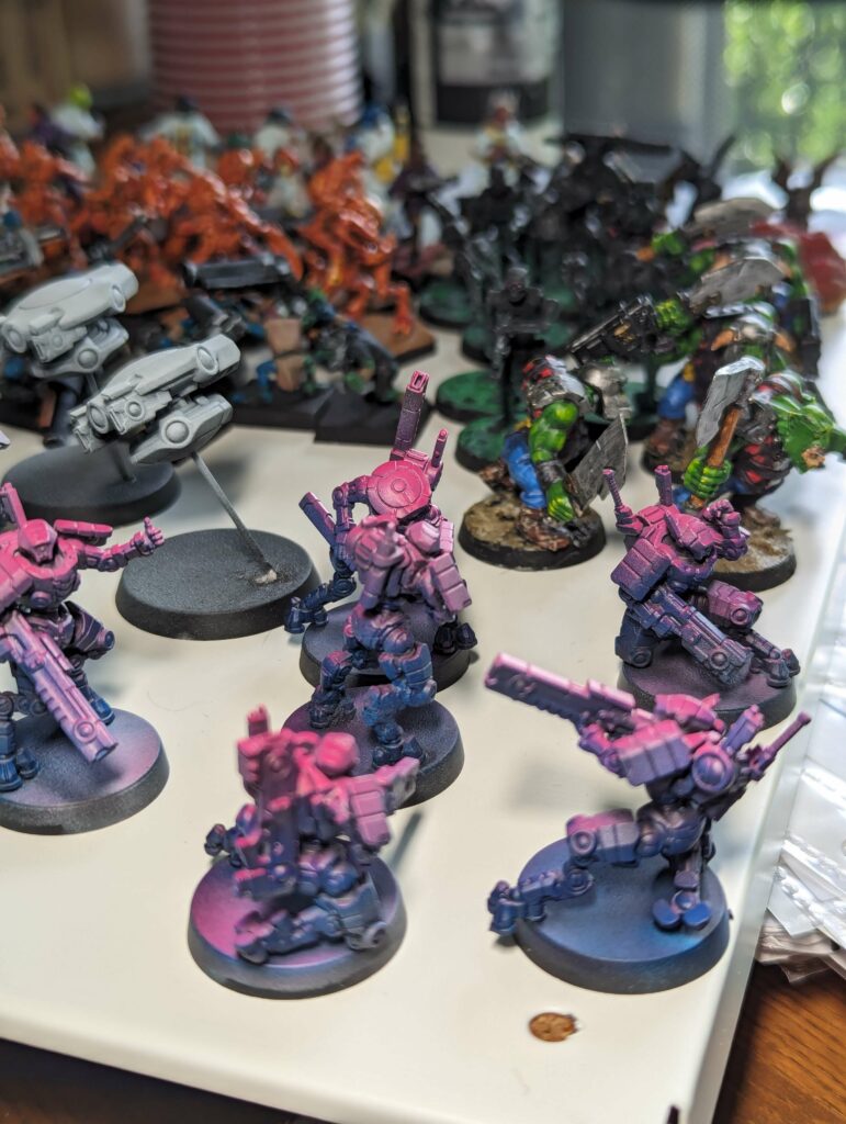
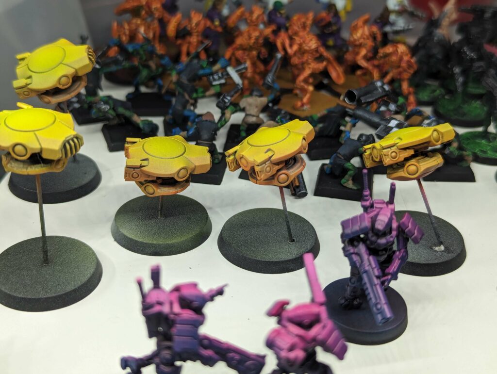
After experimenting with how much white I wanted to use and when, on spare gun drones, I went with a kind of non-zenithal for my fireteam with a very very dark grey on the bottom, a midtone grey in the middle, and a wide bright white highlight from the top. Then I shot cyan from below up to level and magenta from top down to level. This got me the deeply desaturated dark blue on the bottom, a shadow purple in the middle, and a very bright magenta on top. I found during the process that crossing the streams got my much nicer blends; getting just a little blue fogging up past the middle and just a little magenta down past it got me not just a lovely purple but a nice smooth gradient. Since these gradients are a hallmark of synthwave and related styles it was a happy and useful discovery. No mistakes just happy accidents, right? But experimenting helped.
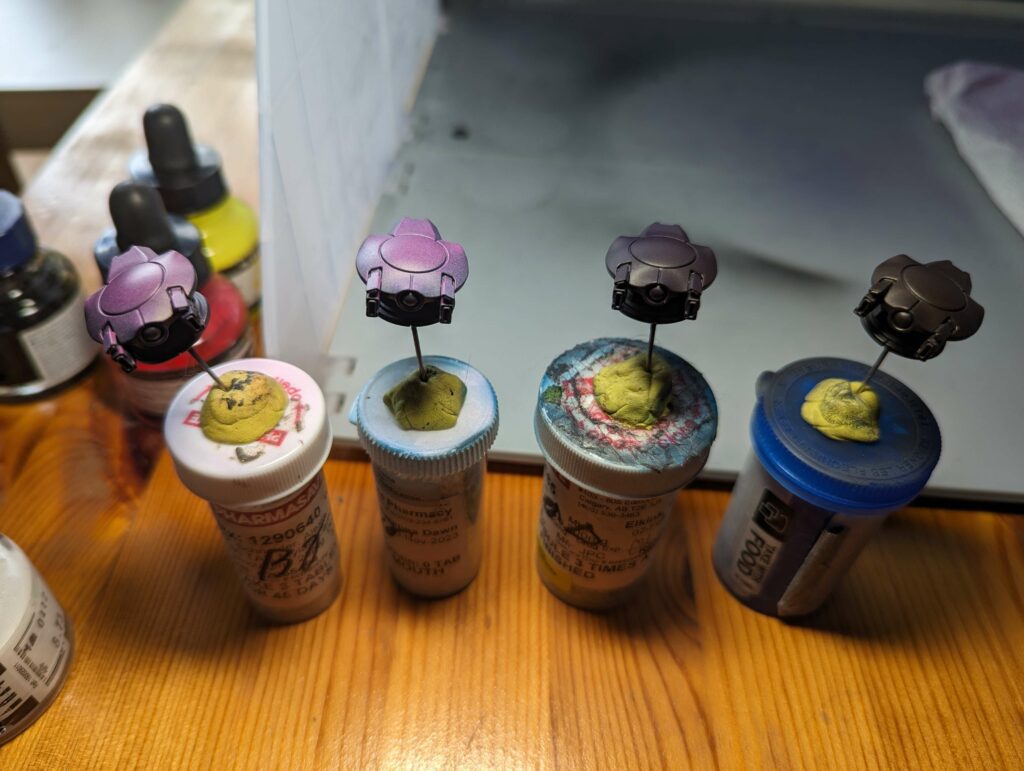
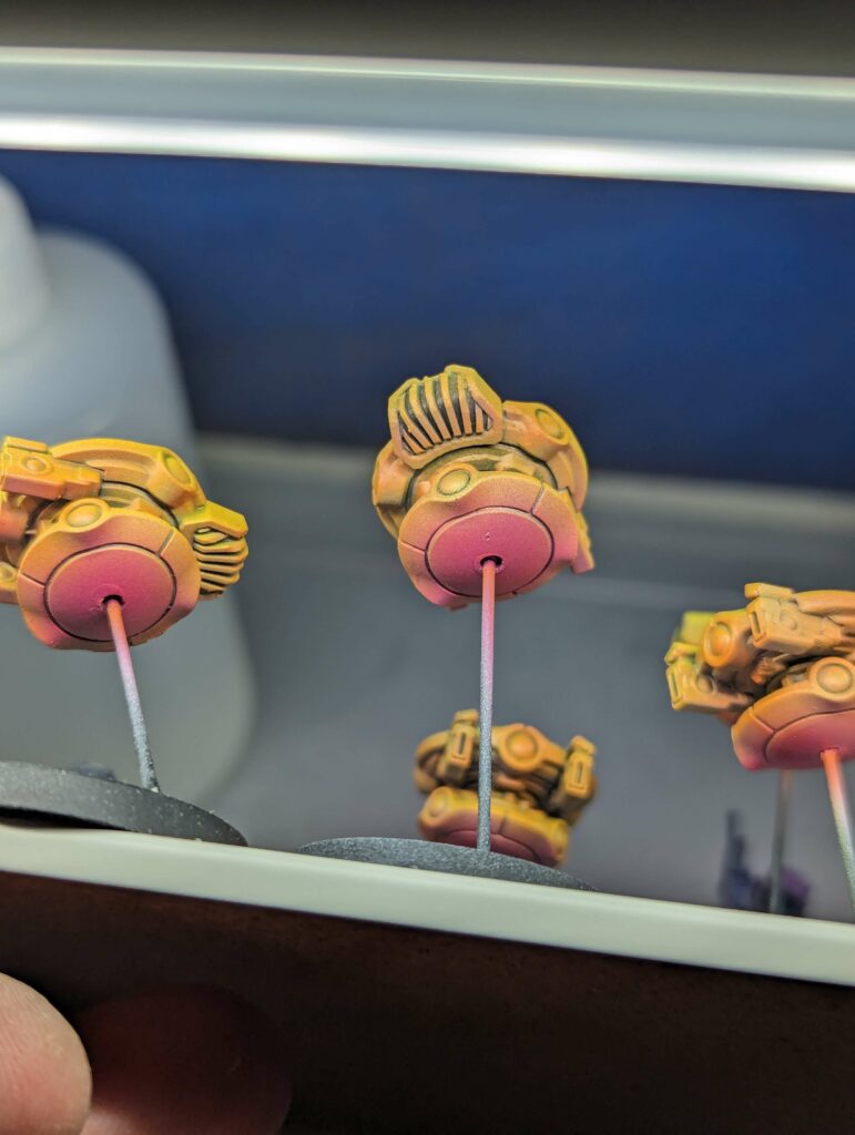
Speaking of experimenting helping, I discovered that the hard edges on the gun drones created shadows for my airbrushing- like, they blocked paint spray. Obvious in retrospect but the result, while cool, was much less gradient than I was looking for on this particular project. I’m looking for a thematic paint scheme, and gradients is becoming a pretty important part of that. So, I ended up doing some careful extra spraying of my magenta just to get a faint fade on the top shelf, and the same with yellow on the bottom, and the middle orange layer turned into a nice gradient that helped make the top yellow pop nicely. ALSO, the gun drones are not just looking like synthwave suns, but the sticks that keep them off the ground mean that when they’re next to my fireteam the magenta at the top of the fireteam models is just about the same level as the magenta on the underside of my gun drones, and they look accidentally but especially “same team, visually distinct units.” I’m pleased.
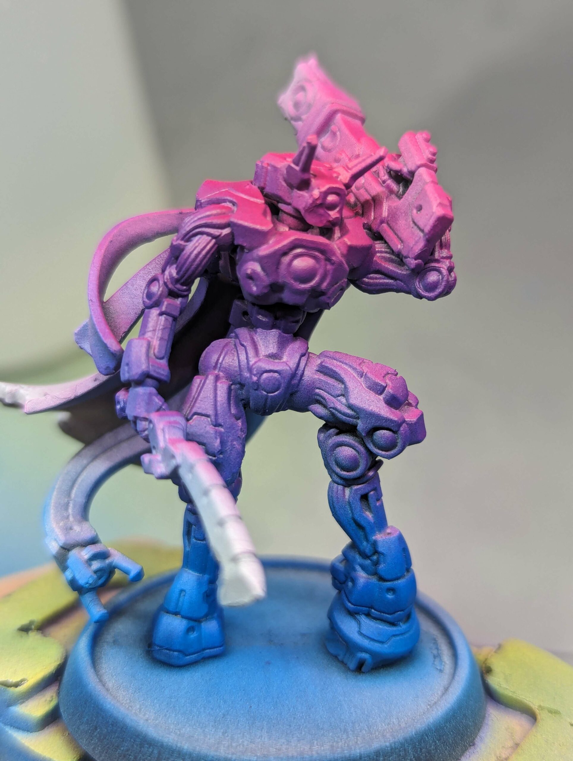
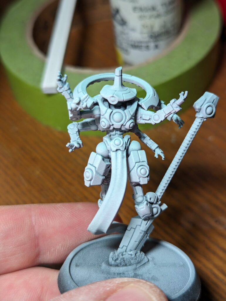
Next up was my fireteam commander (main image). Apparently saturation is how the fireteam indicates rank, because this guy got as much white primer as I could manage without hosing his panel lines, a much more visible blue, and a much more visible purple than his gay commie comrades. He stands maybe twice as tall as them, but is the same sort of model, a shooty guy with some buff and support skills. I wanted him to be obviously a big brother of the fireteam but also to stand out enough to easily tell the difference if he’s in the middle of them. I think I nailed it? His size helps of course but more importantly the saturation gives him more visual impact while staying in the theme. Anyway, I’m going to work on his cloak (violet) and weapons (glossy black with some plasma glow style OSL). The fireteam will probably also get glossy black weapons.
With him and his fireteams I’m going to take some lessons from my orks. Which, first, is minimizing per-unit work. Airbrushing most of the colour was step 1 and worked great. Next, I want to maximize effect with minimal effort. In this case, glossy black weapons and lenses should get me some quick and strong contrast. Panel lining will take longer, but if I limit it to the magenta bits I think it’ll get 80% of the effect with 20% of the effort and really pay off. My commander will get pink edge highlighting further down to the purple parts because he’s a special non binary communist robot. For the fireteam, I think I’ll do some edge highlights just on the magenta parts because it’ll get maximum contrast with the panel lining. Again, that 80/20 split on the regular units pays off. I’ve probably only spend the first third of the time on the fireteam and gun drones that I will eventually, but I’m also way farther ahead than with the orks. So yay!
Finally, my robot caster “ethereal.” I have a couple ways to go with synthwave. There’s outrun (which is more sun/sand blue and pale gold) and there’s vapourwave (which is more early 90s computer graphics, lots of pastels), and there’s other more specific or more niche looks. It doesn’t show up as much on camera, but I went with vapourwave for this unit, white everywhere, pastel pink undershot and pastel mint green highlight. Obviously with white instead of black, and minimal colour on the unit compared to synthwave, he’s very very different from the fireteam. However, because vapourwave is related to synthwave, I feel like the conceptual theme does a lot of work to tie it together with the rest of the army. My plan is to do a pretty strong orange-to-peach gradient on his crotchscarf, and to really sell the vapourwave I’m going to do some armour panels in pastel purple, blue, and pink. Panel lining will be important for this model. For the weapon I think I’ll do something like a slightly stronger pastel rather than the glossy black.
This army will eventually get some vehicles and stealth mechs. I’ve tried some “matte black, blue plasma glow” test models for the future stealth mechs and I like it, gives real “synthwave blue grid floor/Tron” vibes. For the vehicles I’m strongly considering 90’s Jazz mall-cup design, flat white with teal brushstroke and purple fingerstroke. Getting pretty far from both the synth/vapour theme there as well as the “painted to match their home environment” (as if the ethereal wasn’t doing that already), but once again the conceptual theme would carry a lot. Plus the jazz brushes painted as go-faster stripes along the sides would look pretty great. I’m not married to 80s over 90s, I’m not married to synthwave over any other option, but I am married to making “my “painting my army” less of a fucking grind than 20 orks were. Doing different stuff helps a lot with that. On the one hand I can imagine a complaint of “oh they don’t all look the same” but on the other hand fuck off, this is fun and I’m doing this for fun, right? Anyway, I’m still not 100% sold on the jazz but it’s a great plan I’d be happy to paint and I haven’t come up with anything better yet. Next best option would be painting them like Corvettes, which would indeed be hilarious and thematic, but not exactly what I want.
